Your brand has all kinds of tiny UX touchpoints on your site. One of those is your newsletter signup.
Some people use a signup field with all the personality and lead-gen potential of a dessicated mouse corpse. This tells me that (a) they don't want anyone to subscribe to their newsletter, (b) their brand is as boring as The English Patient, and (c) they don't think the small things matter.
Here's a list of email signup forms, from unfathomably lame to actually good.
1) This form makes me wonder why they bother at all:
There's nothing about the newsletter, what you'll be getting, how often you'll get it, or what you'll get out of it. Why don't they just add a middle finger?
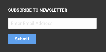
2) Email updates?! Awesome!
They're bludgeoning me with "Sign Up" twice. That they think they need a copyright notice under that form makes me laugh, and the social buttons don't belong there.

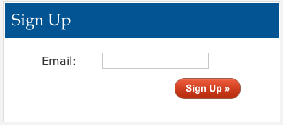
3) WTF
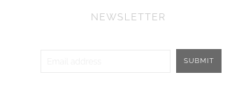
4) This one has a modern, clean look. (So clean you might not be able to even see it.) But what am I going to get? An email every few months with injury care tips for roller derby teams? An email every few hours giving me detailed updates on a family of raccoons? Contextually, you can assume they're updates, but give us something.
5) This one makes me want to throw hammers. "Not Convinced?" No, not quite:

Excuse me while I go use my rubber mallet on a cardboard box.
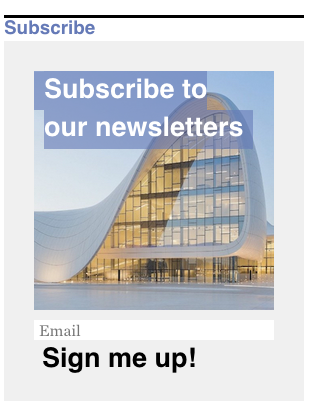
6) At least this one has an image...and some modicum of enthusiasm ("Sign me up!" is better than "Sign Up")...but it has "subscribe" twice. Please stop. And exactly how many newsletters am I getting? Boo.
7) This one's an improvement. It's got a little social proof near the button, but it doesn't need that bit about the plans. And "Sign Up" isn't lighting the world on fire.

8) Wow, updates straight to my INBOX? What a world! Has that ever been done before?
Pluses: Cute little image. Orange button (that has tiny text and the dreaded "sign up here"). We've got "Sign up" twice. I'm digging furrows into my desk.

9) On this one, the color should be reversed, with a pink button rather than a pink background. But at least it's an eye-catching color box. The button text is blah, but at least they add "now," and you have some idea of what you'll get (Every week? Every day? Who knows?).

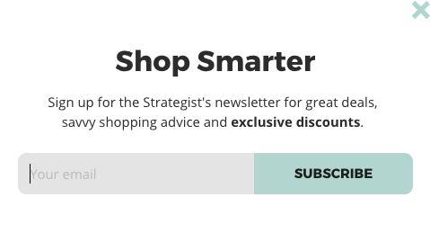
10) Shop Smart. Shop S-Mart.
Some improvement here. A headline that's something other than "Sign up for our newsletter," and you know what you're getting (just not how often). The button is about as interesting as Meet Joe Black, but at least the text is noticeable.
11) I'm starting to calm down a little. This form tells you often they'll email you, and it has a whimsical way of describing what you'll get. Join Us, gabba gabba. We still have "Subscribe Now" and "Sign up," but the form has some personality.

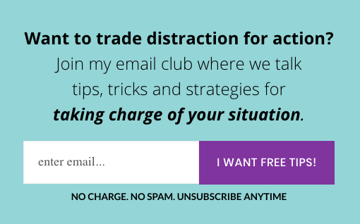
12) This one has a solid headline, some specifics on what you'll get from subscribing, and a high-contrast button. It's good to see text like "I Want Free Tips," but it's better suited to a content offer where you actually get tips for something, so it seems like you're getting something other than what's described. How about "I Want to take Charge"?
Speaking of the word "charge," there's a nice anxiety-reducer under the form, but they can get rid of the unecessary "no charge." It's not a mastermind group, it's a newsletter.
And for this kind of thing, you'd also want to get a subscriber's first name. If it's an "email club," first names should be involved. Or do they use numbers?
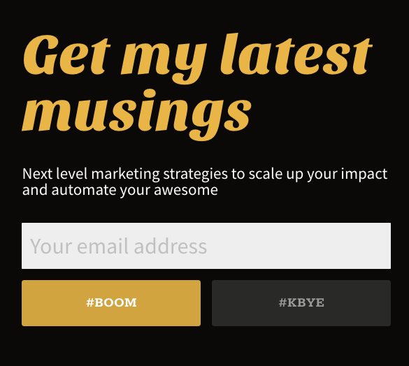
13) Hello. Sharp look, clear benefit—and punchy copy with personality, including those fun hashtag buttons. The buttons have different looks, and there's much more emphasis on the desired action. Yay!
(I'd hyphenate "next-level")
Am I guilty of being too lax with my own email forms? Probably. But let's recap: Put some thought and personality into the details. Also, "Subscribe" and "Sign Up" are the lead-gen form versions of this thing (only not memorable at all):